I use Adobe apps every day. Photoshop, Illustrator, InDesign. They all get updates regularly, and Adobe has done an amazing job of making that user experience as absolutely horrible as it can. So bad, in fact, that I have to question whether or not the company even uses its own products.

Just to be clear, I’m using Creative Suite 6. I haven’t made the move to Creative Cloud yet because I don’t have a compelling reason to upgrade based on my needs. Here’s how the update process goes:
A button appears in my Mac’s menu bar showing the Adobe logo and a number telling me how many updates are ready. I click the button and get a drop-down menu with an option to launch the Adobe Updater app — no list showing me which apps have updates, just an option to launch an app. Yes, I know the update interface is better in Creative Cloud, but that’s not the point. It never should’ve been like this in the first place.
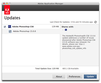
Once the Adobe Updater app launches, I see a list showing which apps have updates ready to download and install. Selecting an app shows what’s changed, or at least it sometimes does. Often, like with the most recent Photoshop update, I’m told it “addresses a number of issues discovered after Adobe Photoshop CS 6 (13.0) software was released,” with a URL for more details. You can’t click the URL. Instead, you have to click and drag to highlight it, copy it, and then paste it into your Web browser to see what’s changed.
So to recap, when there’s an update for an Adobe app I get a button that alerts me to the update so I can launch an updater app that tells me there’s an update. The updater app doesn’t give me details, and gives me a URL that I can’t click to go see what’s in the update I’m about to install.
And someone at Adobe thought this was OK.


Adobe isn’t alone in the poor update situation… Apple’s update UI and explanations can be just as obtuse.
Very true. Unfortunately for Adobe, it was their interface I saw when I finally hit my breaking point and let loose with my rant.